How does this market environment compare to recent history? If there was a big market reversal, could that trigger a financial crisis? I recently took a look at these questions through the lens of volatility.
In particular, I focused on three measures: S&P 500 implied vol (VIX), government bond implied vol (MOVE) and BBB credit spreads. Comparing them isn’t easy. They each have a different scale and the economy’s evolution over time means deciding what a ‘normal level’ for each is tricky.
For these reasons, I looked at each in terms of percentile distributions over rolling 10-year windows. For example, if today’s credit spread is the lowest its been in the last 10 years, it gets a score of 1. If today’s spread is the highest its been in the past decade, it gets a score of 100. These rolling percentiles allows the different vol measures to be compared in the same units and gives us a sense of how normal things were at each point in time relative to the preceding decade.
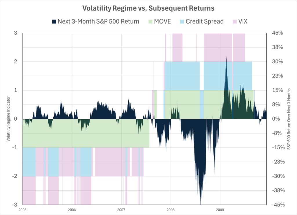
That still yields pretty messy graphs, so I went a step further and invented a definition for high and low volatility regimes. I labelled any number 25 or lower as ‘low vol’ and any reading 75 or higher ‘high vol’. Basically, if the VIX, MOVE or credit spread is in the bottom quartile of the distribution over the last 10 years, I consider that to be a low volatility environment and assign it a score of -1. Readings in the top quartile are high volatility regimes and get a +1. Every other reading is 0.
The Great Moderation That Wasn’t
Then I plotted those scores together for different episodes of market distress. I wanted to see if big market crashes were preceded by low vol regimes. Let’s start with the GFC.
The years leading up to the GFC were exceedingly calm . Government bonds (green) were in a low vol state every day from 2005 through mid-2007. Equity vol (pink) was mostly low and credit spreads were either low or neutral. The Great Moderation. Only it wasn’t the great moderation – it was the the Rise of Carry. Carry traders sell vol, so as the size and scope of their activity builds it suppresses vol until…something triggers a fall big enough to cause those trades to unwind and we move to a high vol state.
The next graph is Covid. Not quite as ‘perfect’ as the GFC but still multiple years of low vol – and very few episodes of high vol – leading up to a 20% drawdown in late 2018 and then the ‘Big One’ in 2020.
The third graph is the LTCM crisis in 1998. The relationship is not as strong, but again we still see an extended period of very low credit spreads (blue). About 25% of the time before the 1998 crash two indicators were in a low vol state. There were no periods in the years immediately beforehand where two indicators were in high vol territory. The crash itself was not as dramatic, but remember the magnitude of carry trades was smaller, therefore the impact of the vol spike was not on the scale as the GFC or Covid.
Dotcom Era Volatility Regime Was Different
I then looked at the bursting of the Dotcom bubble. In the Rise of Carry we didn’t identify this as a classic carry crash because it isn’t clear that it was driven by an unwind of levered trading. It was more like a modern Tulip mania focused on early internet and telecom stocks, but primarily driven by excessive new issuance at inflated prices.
Indeed it looks quite different than the other episodes from a vol perspective. The first big drawdown hits in late 2000 but that was preceded by a period of normal-to-elevated vol. There were other nasty episodes in early 2001 and 2002. That did trigger a recession and unemployment rose from 4% to 6%, but there was no financial crisis.
The last graph is where we are now. The S&P 500 has rallied to very expensive valuation levels but this has not happened against a backdrop of persistently low vol. For a time in 2024 it started to look like that – both VIX and credit spread were in ‘low vol’ regimes during the summer. But the yen carry crash sent the VIX back to more normal levels. Bond implied vol has been elevated for almost three years.
I guess the strap line from all of this is that, at least from a volatility perspective, the situation today looks more like the Dotcom environment that the GFC. Maybe that means we’re more likely to experience sporadic pull backs over an extended period rather than the earthquakes that hit in 2008 and 2020? These could easily be famous last words. There may be enough hidden leverage in the system that a S&P 500 drawdown of 20% could trigger a financial crisis.
Comparing Valuations Before Big Drawdowns
Here’s a quick summary that compares valuation levels on the eve of each of these periods of market distress.
The right two columns are simple valuation metrics. The first is the spread between the real earnings yield and the real bond yield. The second is my measure of the additional risk premium the market is offering equity investors relative to bond investors. It’s interesting that on both these measures equities did not appear to be in ‘bubble’ territory prior to the big GFC/Covid crashes. I think that is consistent with those events being more driven by system-wide deleveraging and a subsequent dash for cash.
I don’t have a snappy conclusion! But I thought these graphs were interesting enough to share and contemplate.
Read the full article here


